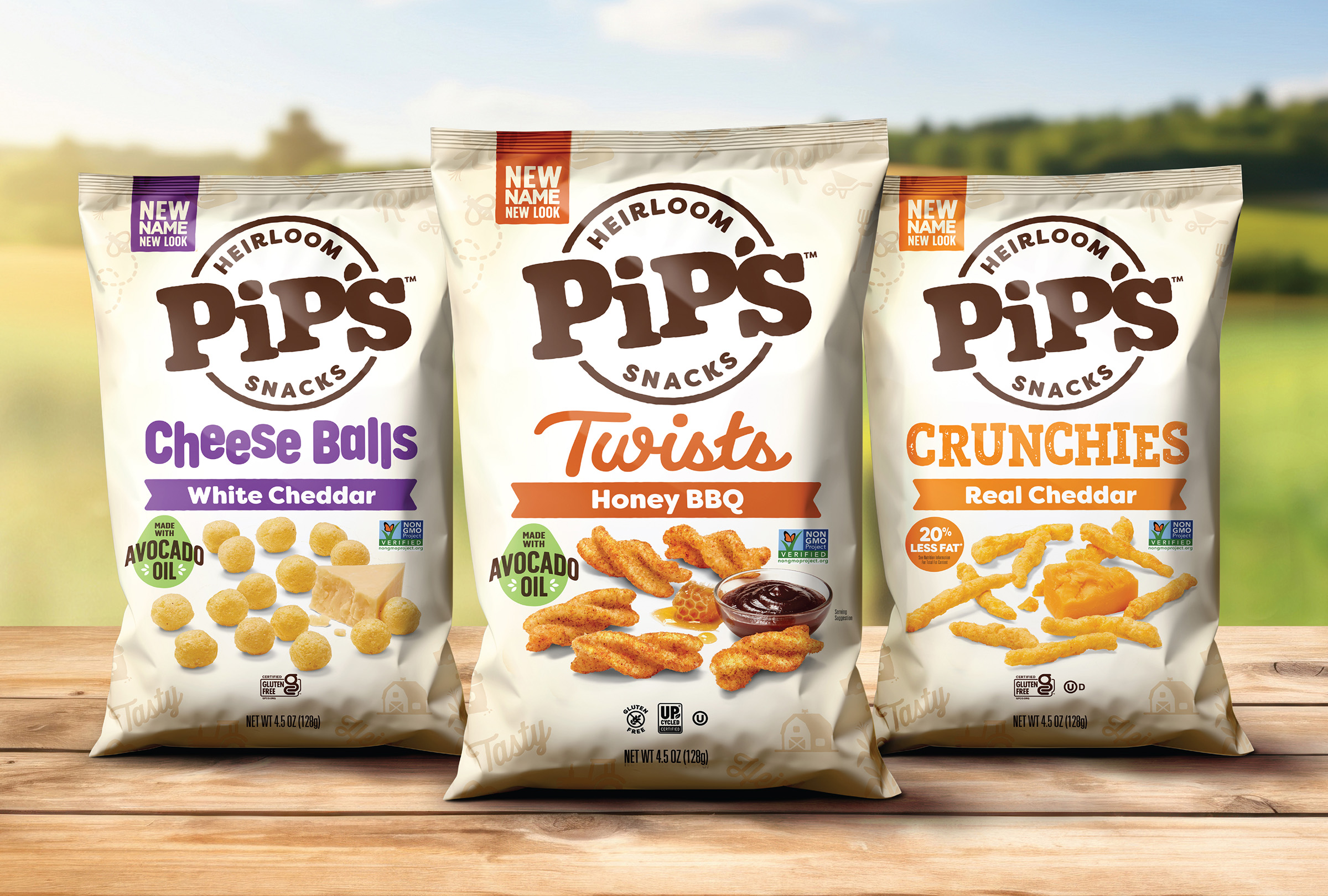
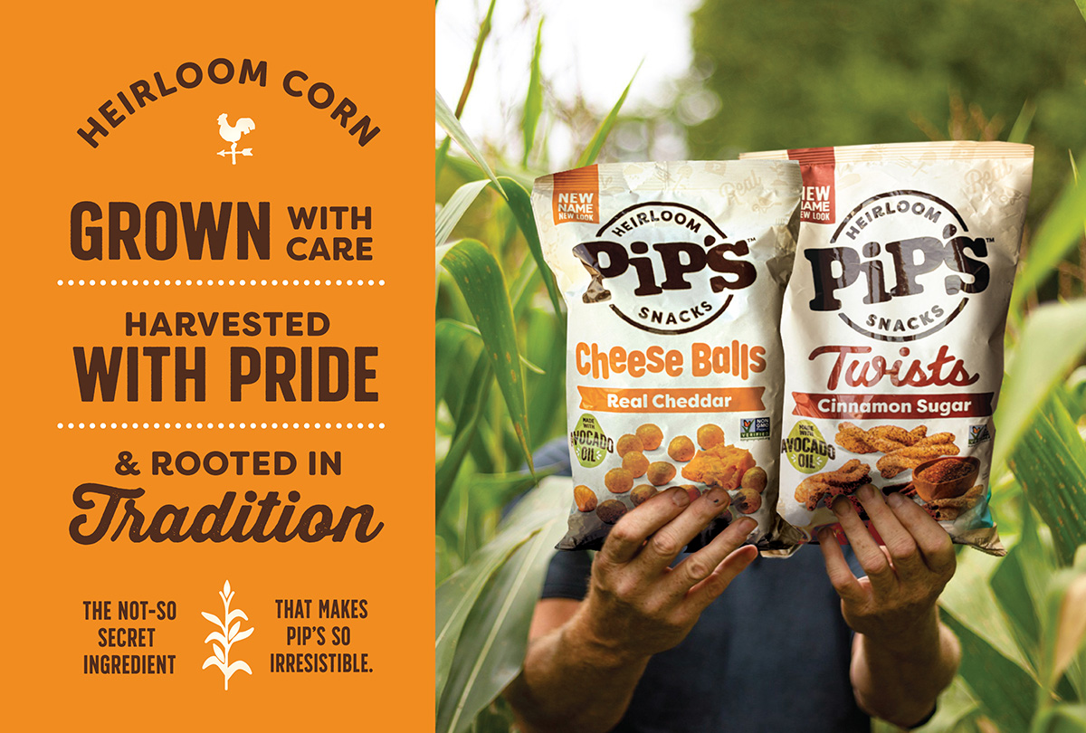
Pipcorn, a brand known for its' heirloom popcorn, experienced remarkable growth by expanding its product line to include cheese balls, twists, and other snacks. However, with this expansion and a saturated market, the brand saw a decline in base velocities.The packaging, while award-winning, was losing its disruptive edge on the shelf. This, combined with an impending merger with Spudsy - an upcycled sweet potato snack brand - presented a complex challenge: create a unified, disruptive brand architecture and design that would increase sales, capture attention, and lay the foundation for a cohesive, long-term brand identity.
HBX developed a new brand architecture and visual identity that strategically addressed both the immediate need for increased velocity and the long-term vision for the merged company.
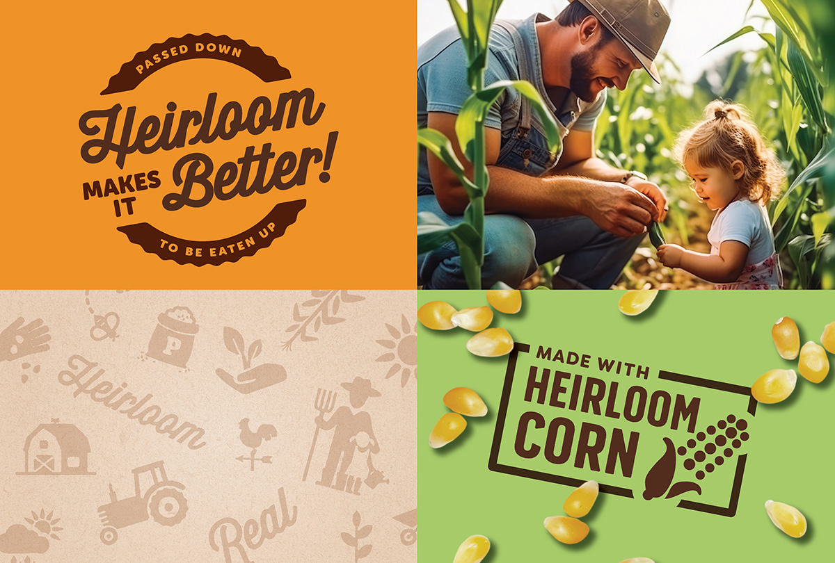
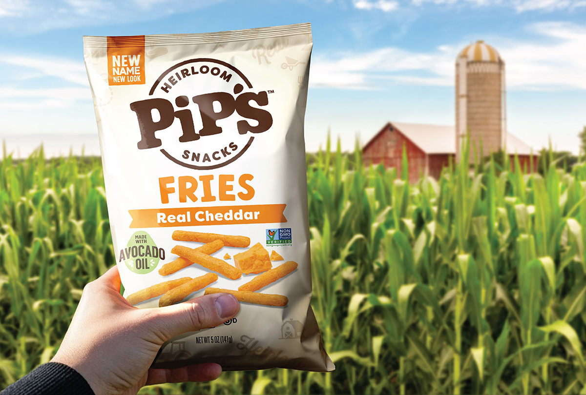
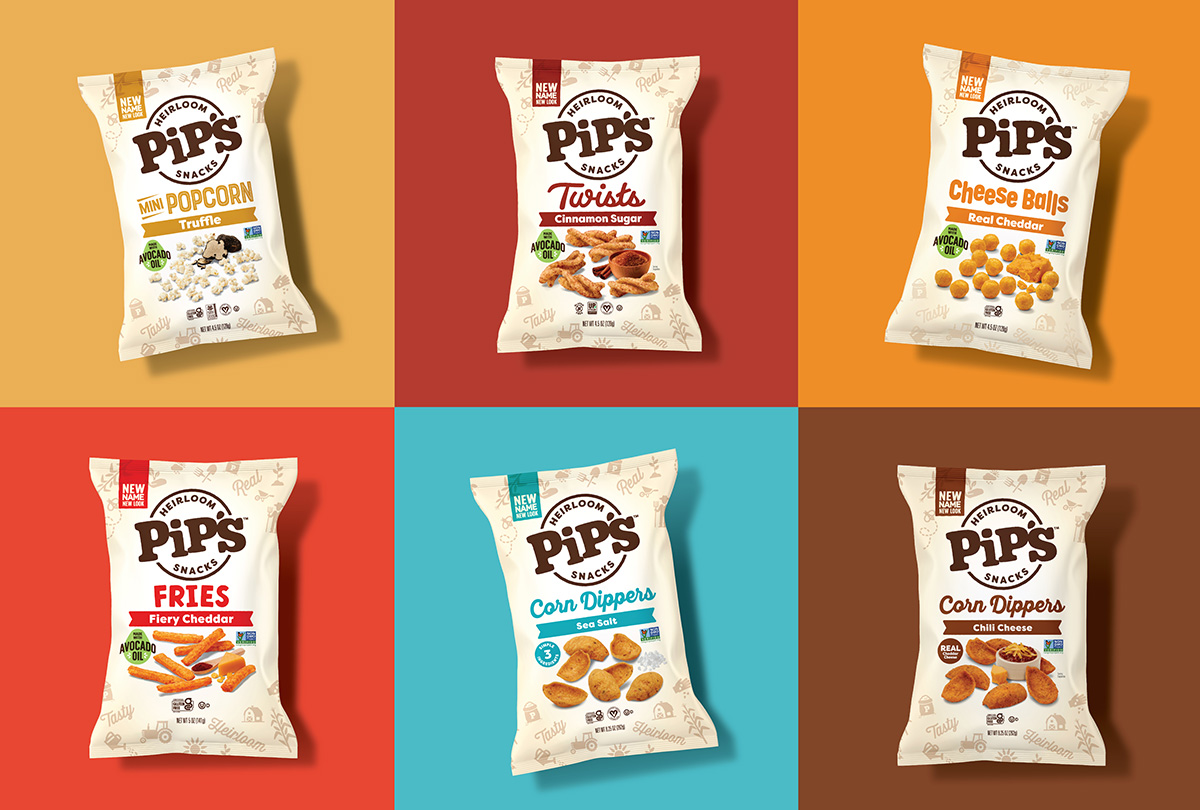
The new design leverages a more disruptive approach to packaging, utilizing bold, contrasting colors and dynamic typography to cut through the clutter on the shelf. The design framework is scalable and flexible, allowing for new products and flavors across both the heirloom grains and upcycled potato platforms. It also prioritizes taste and quality cues with enhanced photography, ensuring the packaging not only grabs attention but also justifies the brand's premium price point.
The new brand strategy and design provide a clear path forward for the combined entity, strengthening its' position in the competitive better-for-you salty snack market and setting the stage for future growth and innovation under the new all-encompassing name,“Pip’s Heirloom Snacks”.
+ Research & Analytics
+ Competitive Audit
+ Communication Hierachy & Messaging
+ Naming & Tagline
+ Brand Identity
+ Packaging
+ Photography
+ Illustration
+ Production Mangement


HBX has been my go-to branding agency for years. I can always rely on them to deliver above and beyond my expectations.
Pipcorn, a brand known for its' heirloom popcorn, experienced remarkable growth by expanding its product line to include cheese balls, twists, and other snacks. However, with this expansion and a saturated market, the brand saw a decline in base velocities.The packaging, while award-winning, was losing its disruptive edge on the shelf. This, combined with an impending merger with Spudsy - an upcycled sweet potato snack brand - presented a complex challenge: create a unified, disruptive brand architecture and design that would increase sales, capture attention, and lay the foundation for a cohesive, long-term brand identity.
HBX developed a new brand architecture and visual identity that strategically addressed both the immediate need for increased velocity and the long-term vision for the merged company.
The new design leverages a more disruptive approach to packaging, utilizing bold, contrasting colors and dynamic typography to cut through the clutter on the shelf. The design framework is scalable and flexible, allowing for new products and flavors across both the heirloom grains and upcycled potato platforms. It also prioritizes taste and quality cues with enhanced photography, ensuring the packaging not only grabs attention but also justifies the brand's premium price point.
The new brand strategy and design provide a clear path forward for the combined entity, strengthening its' position in the competitive better-for-you salty snack market and setting the stage for future growth and innovation under the new all-encompassing name,“Pip’s Heirloom Snacks”.
+ Research & Analytics
+ Competitive Audit
+ Communication Hierachy & Messaging
+ Naming & Tagline
+ Brand Identity
+ Packaging
+ Photography
+ Illustration
+ Production Mangement
HBX has been my go-to branding agency for years. I can always rely on them to deliver above and beyond my expectations.
Welcome back! Check out some other favorite projects of ours.


