Thank you! Your submission has been received!
You will receive your files shortly via email.
You will receive your files shortly via email.
Oops! Something went wrong while submitting the form.


In a remote-working world where packaging mockups fly across email chains and creative reviews happen over Zoom, the process of choosing brand colors has never been more convenient — or more deceptive.
Let’s cut to the chase: if you’re viewing your brand colors exclusively on a screen, you're not seeing your brand colors. You're seeing an approximation, a stand-in, a well-meaning imposter filtered through compression, screen calibration, and video conferencing software that, frankly, never signed up to be part of your brand strategy.
At HBX Branding, we’ve seen this scenario unfold all too often. A vibrant coral suddenly appears dusty salmon. A rich forest green takes on an unexpected swampy tint. It’s not a creative misstep — it’s a technical one.
So how do you avoid stepping into the color confusion trap? Simple: insist on a color process that’s grounded in reality. Here’s how we ensure our clients feel confident that the colors they choose are the colors that stick — across packaging, print runs, and platforms.
Your agency should tell you outright: what you see on screen is not what you’ll get in print. Period.
From screen to screen, colors shift wildly. Add in the compression of video calls, and you're left with a version of your brand identity that's been filtered through a dozen digital lenses. That turquoise that looks cool and fresh in your Zoom review? It might print seaweed green if you're not careful.
Color accuracy begins with a universal language. Enter: Pantone.
Pantone colors are the gold standard for ensuring your brand color is consistent — no matter where or how it's printed. By selecting a Pantone match early on, you're setting an unshakable foundation for every vendor, manufacturer, and designer involved.
Digital approximations are useful for speed, but nothing beats physical proof. Your agency should send you physical Pantone chips — the swatches pulled directly from the Pantone library — so you can see and hold the color in real life. This chip will be your benchmark for every press run moving forward.
Somewhere along the way (and ideally more than once), your agency should send you a color-accurate proof — a printed version that reflects exactly how the final product will look. Not just to ooh and aah over the design, but to verify that the color behaves the way you expected under real-world conditions.
Sometimes you get the chip or the print and realize: this isn’t what I had in mind. That’s okay. That’s what this step is for.
A good agency will work with you to troubleshoot and choose an alternate color, adjusting until the vision matches the reality. Think of it as your color safety net.
Once your colors are locked, your agency should distribute the Pantone numbers, chips, and color-accurate targets to any print vendors you're working with. This guarantees that every party is aligned — and no one is guessing what “mint green” means.
Your agency should also offer on-press supervision to verify that the final print is in perfect color harmony with your approved target. It’s the last checkpoint between your vision and the shelf — and well worth it.
Once everything’s finalized, you should walk away with your color assets in three essential formats:
This trio ensures your brand color maintains its integrity across every platform and medium.
Color perception isn’t just about process — it’s also about environment. Here are a few extra pointers to help you make smart, color-accurate decisions:
Your brand color isn’t just a hue — it’s a handshake, a first impression, a visual shorthand for everything your brand stands for. It deserves more than a “close enough” approval on Zoom.
Digital tools are incredible for prototyping, rapid iteration, and big-picture visualization. But when it comes to choosing the colors that will define your brand for years to come, only the real thing will do.
At HBX, we believe color should be a source of confidence, not compromise. So take the time, trust the process, and don’t be afraid to demand color that delivers — on screen and on shelf.


Design, Branding, Color Management
Have you ever viewed a designer's colors via Zoom a hundred times, only to find out the real printed color looks nothing like what you thought it would. The following are a few steps to make sure this never happens again.
This is the current page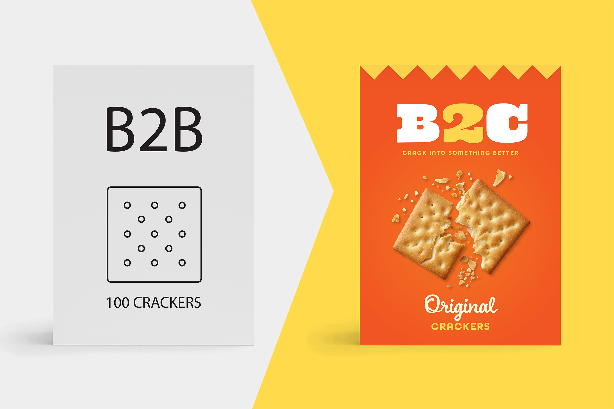
Strategy
If you're current strategy is purely B2B, it may be time to think about taking your offer directly to consumers.
This is the current page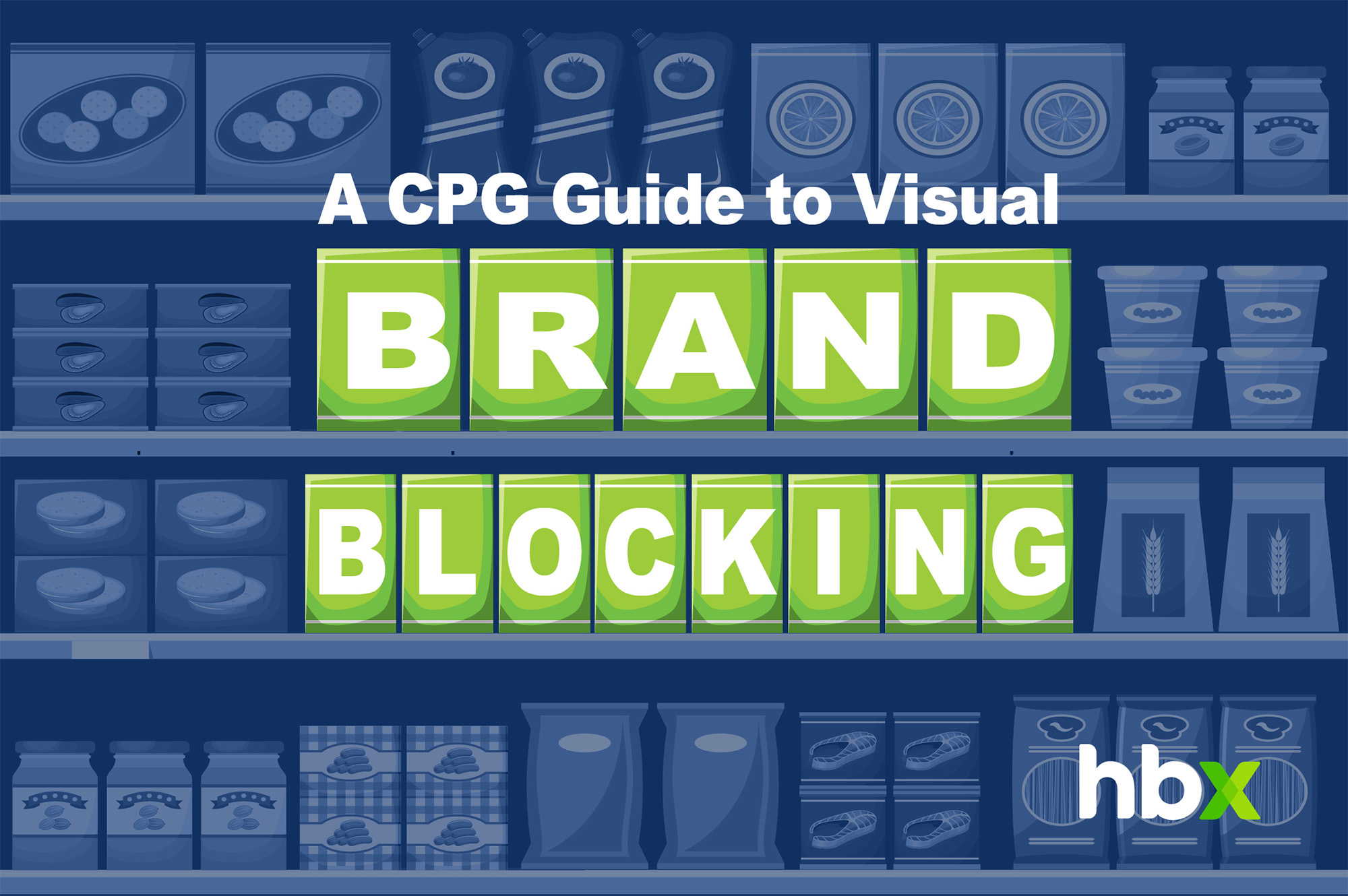
Design, Strategy, Branding
A guide to the what, how, and why of great brand blocking.
This is the current page
Design, Production, Consumer, News
By learning what recycling and sustainability symbols mean, consumers can reduce contamination in recycling streams, support responsible brands, and contribute to a more sustainable future.
This is the current page
Branding, Strategy, Design
While your package is the foundation of your brand, e-comm content allows you to create an enhanced online experience that allows online shoppers to interact with your product.
This is the current page
Operations
Download our Ultimate Packaging Design Prep Checklist and supplementary tools to save time, money, and sanity on your next Packaging Design project.
This is the current page
Design, Strategy, Branding
Color is a powerful branding tool. Choose a palette that reflects your values, resonates with your audience, and stands out from competitors. Stay consistent across touch points to build recognition, trust, and emotional connection.
This is the current page
Design, Strategy, Branding
From strategy to design to activation, this case study offers an in-depth look at the total process of creating the Delve brand from the ground up.
This is the current page
Branding, Strategy
From key callouts and brand stories on packaging to longer-form writing opportunities like emails and websites, this is how to ensure that all copy across your brand presents a harmonious message.
This is the current page
Strategy
Great packaging design isn’t just about creativity—it’s about having a structured process that transforms ideas into impactful solutions. In this article, I’ll walk you through the key phases, from research and ideation to validation and production, showing how a defined approach ensures both strategic alignment and flawless execution in packaging design.
This is the current page
Production
Production proofing is a critical collaboration between brand and creative teams, ensuring packaging prints exactly as intended. In this article, I’ll walk you through the four key proofing phases—from drawdowns to on-site press approval—so you can confidently navigate the process, catch potential errors early, and achieve high-quality, consistent packaging production.
This is the current page
Production
The right printing enhancements can make your packaging stand out and feel more premium. In this article, I’ll cover 10 techniques—like Spot UV, soft-touch coatings, and embossing—that add visual impact and tactile appeal. You’ll learn how these finishes elevate perceived value and create a stronger brand presence.
This is the current page
Design, Strategy, Branding
Have you ever poured months into a packaging or branding initiative, only to see lackluster results and zero ROI? You’re not alone. It’s too easy to fall into the trap of prioritizing aesthetics over strategy, leaving packaging that looks great but fails to communicate, engage, or sell. In this article I’ll lay out a holistic framework—covering Positioning, Core Values, Aesthetics, and Functionality—to ensure your packaging not only turns heads but also drives real business growth.
This is the current page
Design
2024 was another year filled with eye-catching trends – some we loved and some not so much. As we say goodbye to another year and ring in 2025, - we’re looking back at some of the biggest trends of the past year and whether we expect them to continue...
This is the current page
Branding, Strategy
Redesigning a heritage brand is a balancing act—honoring its rich legacy while staying relevant in today’s world. This article dives into practical strategies to help brands evolve thoughtfully, keeping their history alive while connecting with modern consumers.
This is the current page
Strategy
Crafting a stand-out brand strategy is both an art and a science. This article explores five key components—research, purpose, positioning, personality, and messaging—to help your brand resonate, differentiate, and thrive in today’s crowded marketplace. Let’s shine!
This is the current page
Management
At HBX Branding, our collaborative, purpose-driven culture blends creativity, growth, and laughter. This reflection shares my gratitude for a career filled with remarkable colleagues, shared values, and meaningful client relationships. It’s personal, joyful, and deeply fulfilling. From the heart!
This is the current page
Design, Branding
Visual brand equity is the heart of consumer recognition and trust, but how do you define and strengthen it? In this article, we’ll explore what it means, how to assess its impact, and ways to evolve it thoughtfully. Let’s uncover your brand’s potential together!
This is the current page
Production
Understanding the printing technique you’re working with is key to ensuring your packaging shines. In this article, we’ll break down the strengths of Flexo and Digital printing—covering setup, cost, image quality, and versatility—so you can confidently navigate your printing process. Let’s dive in!
This is the current page
Branding
Your brand’s story doesn’t stop at the package—it continues online. In this article, we’ll explore how to maintain a cohesive look and feel across digital channels, leveraging packaging elements, tone of voice, and tailored content to create a seamless consumer experience. Let’s bring your brand to life, from shelf to screen!
This is the current page
Packaging
Barcodes may seem small, but they’re essential to your product’s success. In this article, we’ll explore common pitfalls and best practices for ensuring your barcode scans perfectly every time, from proper sizing to high-contrast colors. Let’s decode the details!
This is the current page
Packaging
Feature-Creep sneaks in when too much is packed into your packaging design, diluting your brand’s core message. In this article, we’ll explore why it happens, its impact on communication, and how to embrace simplicity to keep your message clear. Let’s unpack the essentials!
This is the current page