When Schuman Cheese, a leader in the global cheese industry, looked to HBX to help launch Delve, we knew that it was an opportunity to usher in a bold new era in the cheese snacking category. From positioning and outlining strategy to developing the brand identity and packaging, each step played a role in launching and promoting Delve. These efforts further emphasized the innovative product’s unique qualities, providing a strong foundation for building the brand.
As a first-of-its-kind mascarpone-based cheese dip and spread, we identified an opportunity to position Delve as a brand crafted for foodies. With its rich, creamy texture from the mascarpone base and award-winning cheeses from the Schuman family, we knew the product had a unique appeal. Combined with innovative and indulgent flavors, it was clear that adventurous cuisine lovers who appreciate quality craftsmanship and artful culinary creations would be the perfect audience.
Foodies care about more than just what they’re eating – for them it’s about the entire experience. To better understand our target audience, we explored three specific foodie mind-sets: the Curious Adventurer, who seeks exotic offerings to enhance their usual meals; The Comfort Seeker, who finds comfort in indulgence and its power to bring joy and pleasure to everyday moments; and the Artisan, who desired quality and craftsmanship that they can create something new with.

Leaning on this understanding of the audience we were trying to target, we began to develop a brand personality that would appeal to the foodie crowd. Delve was positioned as friendly, joyful, witty, flavorful, knowledgeable, and a little snobby (but likable). This is a unique position among cheese brands – the competitive set showed that many higher-end cheese brands came across as traditional and stuffy, while we wanted Delve to feel new and modern yet still premium. The understanding that the brand needed to balance being upscale while still being friendly was something the team kept in mind when beginning to design.
As we began our first round of designs for Delve, we knew that bright colors and an emphasis on flavor were going to be key components of our design to quickly communicate to consumers in store. The team experimented with a variety of visual styles to demonstrate this, like photography to emphasize natural ingredients, illustration to communicate friendliness and joy, script fonts to correspond with the creaminess of the product, windows on the lid to showcase the cheese, and minimalistic imagery to resonate with a young audience seeking modern design.

The client felt that the illustrative style, idea of the “lovable cheese snob”, and being able to see the product best communicated the unique nature and taste appeal while achieving the joyful, friendly positioning. With this feedback, we were able to hone in on these elements to create Delve’s vibrant and energetic visual brand identity.
This culminated in designs for 3 flavors: Garlic Herb Asiago, Basil Pesto Parm, and Whipped Feta. Each tub boasts its own bright color and custom illustrations. The logo itself rests front and center, featuring a smiling "e", sweeping flourishes that communicate creaminess, and a comfortable overlap of letters that feels friendly and fun. Following these main elements, the lid and label both feature an award-winning cheese badge, flavor name, and the brand tagline, “Expertly Crafted by Cheese Snobs!”. The label’s left side is dedicated to the brand story and social handles. These components ensure that consumers have additional brand touch points beyond the physical package.

Delve’s packaging draws consumers: the personality embedded throughout the copy keeps their attention. Writing across the packaging, website, social, and advertising is meant to the carry the tone of a loveable expert. It’s witty but not goofy, proud but not insufferable, and snobby but in a humorous way. Copy became a very important brand elements that allowed Delve to stand out from traditional cheese brands that are stuffy and lack playfulness and enthusiasm.

Tone of voice was one way the team was able to better connect with foodies; photography was another. Delve tastes as delicious as it looks, so using real photography whenever possible is another technique used to highlight the quality of both the dip and the experience of eating it. We collaborated with a food photographer to create bespoke recipes for each flavor, complete with directions and images for each step. The recipes are housed on the Delve website, just one of many features that allows consumers to further engage with the product. The photography assets, as well as videos of the recipes, were also leveraged for social. This contributes to the idea that Delve is not just a food but rather an experience.=

Programmatic and Meta advertising campaigns leveraged the graphic and photography-focused imagery used across packaging, owned social, and the website. To optimize performance, two evergreen ad campaigns were developed—one emphasizing bold graphics and the other highlighting photography—each showcasing Delve’s key reasons to believe. A/B testing determined which approach resonated best, with insights applied to future creative iterations.

Additionally, Super Bowl and March Madness focused campaigns were launched to assess the impact of targeting key entertaining occasions, helping inform the brand’s approach to moment-driven marketing.
At launch, Delve had secured regional distribution in the club channel. To drive awareness and engagement, geo-targeted ads were deployed across Meta and programmatic platforms, targeting category purchasers and consumers likely to entertain. To drive conversions, additional ads ran on Instacart.

Strong initial sales in the club channel fueled regional retail expansion, positioning Delve for potential national distribution. As availability grew, the advertising campaign scaled accordingly to support the brand’s widening footprint.
Recognizing the success of campaigns tied to key entertaining occasions (such as the Super Bowl and March Madness), the brand refined its creative approach to align with these high-engagement moments. To further capitalize on this strategy, Pinterest was added to the marketing mix, enhancing engagement with consumers seeking inspiration for hosting and entertaining.

A strong brand is never static—it evolves alongside its audience and the cultural landscape. As Delve continues to expand its flavor offerings and retail presence, our team remains committed to crafting fresh, engaging campaigns that resonate with cheese-lovers. Whether through innovative advertising, timely content, or immersive social experiences, we’ll ensure Delve stays as bold and exciting as the foodie community it was created for.

Design, Branding, Color Management
Have you ever viewed a designer's colors via Zoom a hundred times, only to find out the real printed color looks nothing like what you thought it would. The following are a few steps to make sure this never happens again.
This is the current page
Strategy
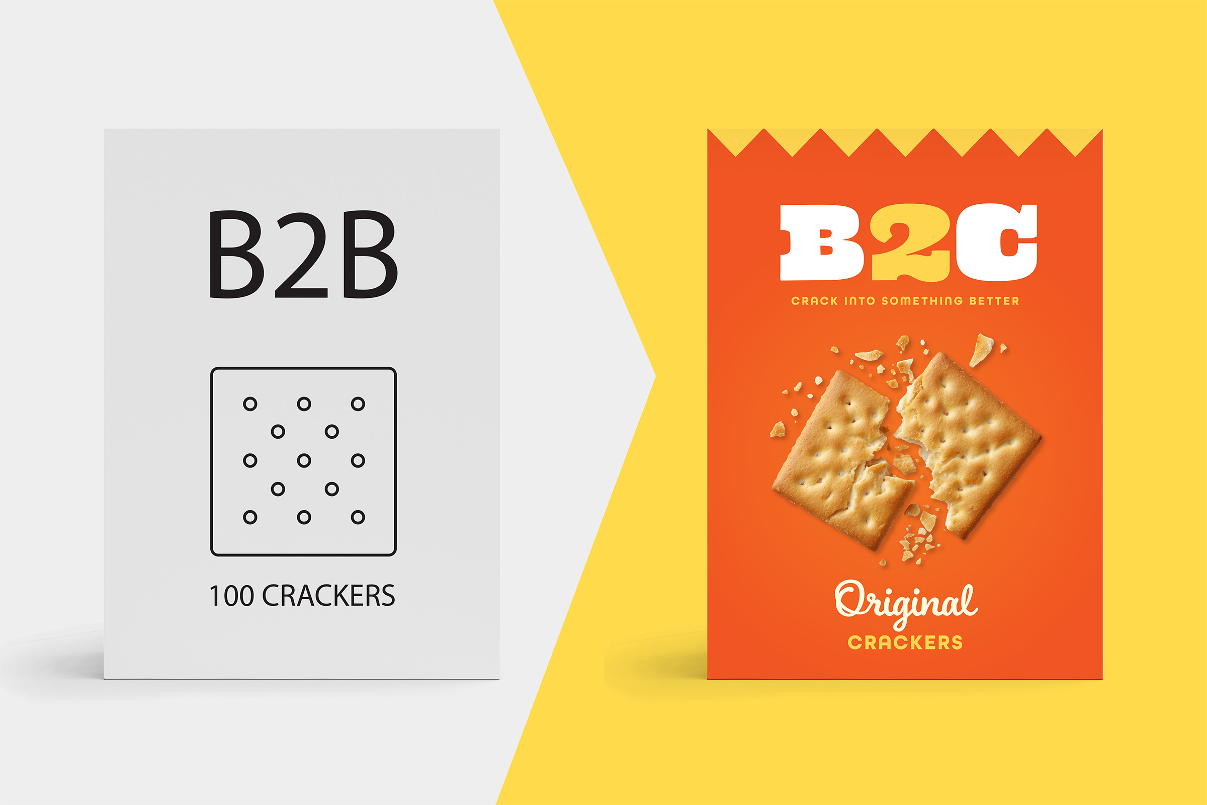
If you're current strategy is purely B2B, it may be time to think about taking your offer directly to consumers.
This is the current page
Design, Strategy, Branding
A guide to the what, how, and why of great brand blocking.
This is the current page
Design, Production, Consumer, News
By learning what recycling and sustainability symbols mean, consumers can reduce contamination in recycling streams, support responsible brands, and contribute to a more sustainable future.
This is the current page
Branding, Strategy, Design
While your package is the foundation of your brand, e-comm content allows you to create an enhanced online experience that allows online shoppers to interact with your product.
This is the current page
Operations
Download our Ultimate Packaging Design Prep Checklist and supplementary tools to save time, money, and sanity on your next Packaging Design project.
This is the current page
Design, Strategy, Branding
Color is a powerful branding tool. Choose a palette that reflects your values, resonates with your audience, and stands out from competitors. Stay consistent across touch points to build recognition, trust, and emotional connection.
This is the current page
Design, Strategy, Branding
From strategy to design to activation, this case study offers an in-depth look at the total process of creating the Delve brand from the ground up.
This is the current page
Branding, Strategy
From key callouts and brand stories on packaging to longer-form writing opportunities like emails and websites, this is how to ensure that all copy across your brand presents a harmonious message.
This is the current page
Strategy
Great packaging design isn’t just about creativity—it’s about having a structured process that transforms ideas into impactful solutions. In this article, I’ll walk you through the key phases, from research and ideation to validation and production, showing how a defined approach ensures both strategic alignment and flawless execution in packaging design.
This is the current page
Production
Production proofing is a critical collaboration between brand and creative teams, ensuring packaging prints exactly as intended. In this article, I’ll walk you through the four key proofing phases—from drawdowns to on-site press approval—so you can confidently navigate the process, catch potential errors early, and achieve high-quality, consistent packaging production.
This is the current page
Production
The right printing enhancements can make your packaging stand out and feel more premium. In this article, I’ll cover 10 techniques—like Spot UV, soft-touch coatings, and embossing—that add visual impact and tactile appeal. You’ll learn how these finishes elevate perceived value and create a stronger brand presence.
This is the current page
Design, Strategy, Branding
Have you ever poured months into a packaging or branding initiative, only to see lackluster results and zero ROI? You’re not alone. It’s too easy to fall into the trap of prioritizing aesthetics over strategy, leaving packaging that looks great but fails to communicate, engage, or sell. In this article I’ll lay out a holistic framework—covering Positioning, Core Values, Aesthetics, and Functionality—to ensure your packaging not only turns heads but also drives real business growth.
This is the current page
Design
2024 was another year filled with eye-catching trends – some we loved and some not so much. As we say goodbye to another year and ring in 2025, - we’re looking back at some of the biggest trends of the past year and whether we expect them to continue...
This is the current page
Branding, Strategy
Redesigning a heritage brand is a balancing act—honoring its rich legacy while staying relevant in today’s world. This article dives into practical strategies to help brands evolve thoughtfully, keeping their history alive while connecting with modern consumers.
This is the current page
Strategy
Crafting a stand-out brand strategy is both an art and a science. This article explores five key components—research, purpose, positioning, personality, and messaging—to help your brand resonate, differentiate, and thrive in today’s crowded marketplace. Let’s shine!
This is the current page
Management
At HBX Branding, our collaborative, purpose-driven culture blends creativity, growth, and laughter. This reflection shares my gratitude for a career filled with remarkable colleagues, shared values, and meaningful client relationships. It’s personal, joyful, and deeply fulfilling. From the heart!
This is the current page
Design, Branding
Visual brand equity is the heart of consumer recognition and trust, but how do you define and strengthen it? In this article, we’ll explore what it means, how to assess its impact, and ways to evolve it thoughtfully. Let’s uncover your brand’s potential together!
This is the current page
Production
Understanding the printing technique you’re working with is key to ensuring your packaging shines. In this article, we’ll break down the strengths of Flexo and Digital printing—covering setup, cost, image quality, and versatility—so you can confidently navigate your printing process. Let’s dive in!
This is the current page
Branding
Your brand’s story doesn’t stop at the package—it continues online. In this article, we’ll explore how to maintain a cohesive look and feel across digital channels, leveraging packaging elements, tone of voice, and tailored content to create a seamless consumer experience. Let’s bring your brand to life, from shelf to screen!
This is the current page
Packaging
Barcodes may seem small, but they’re essential to your product’s success. In this article, we’ll explore common pitfalls and best practices for ensuring your barcode scans perfectly every time, from proper sizing to high-contrast colors. Let’s decode the details!
This is the current page
Packaging
Feature-Creep sneaks in when too much is packed into your packaging design, diluting your brand’s core message. In this article, we’ll explore why it happens, its impact on communication, and how to embrace simplicity to keep your message clear. Let’s unpack the essentials!
This is the current page